Art in the Wild

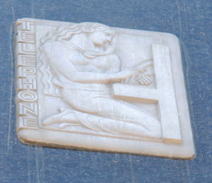
One of 19 Art Deco reliefs on the Ann Arbor News building. The figure is using an ergonomically-challenged switchboard phone system.
Since The Chronicle launched last fall, we’ve been covering the monthly meetings of the Ann Arbor Public Art Commission. At that first meeting we attended in October, the group discussed a project to take inventory of all the public art in the city – the idea is to create a database that can eventually be accessed by the public, giving details of where each piece of art is located, who the artist is, and any other relevant information.
Separately, we were later contacted by a Chronicle reader who said she’d like to see a series about public art in the city – essentially, the same kind of thing that AAPAC is compiling. So until their project is online, The Chronicle will be taking up our reader’s request in an occasional look at this city’s public art. In our definition, we’ll look at art on public and private buildings, as long as it’s visible to the public. We’re starting with something that’s connected to the field of journalism: the Art Deco reliefs on the Ann Arbor News building.
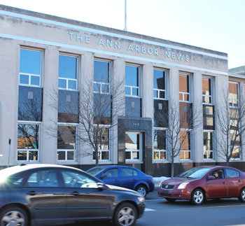
These pieces – 19 of them – are affixed to the original Albert Kahn building that was constructed in 1936 at the southwest corner of Huron and Division. (The building has undergone several expansions and renovations over the decades, so the stateliness of the original structure is somewhat diminished.) The 15-x-12 inch reliefs, made of cast aluminum, are easy to overlook: they’re placed on the upper half of the building and face two busy streets, with lots of motor vehicle traffic but few strolling pedestrians. It’s not the kind of setting where you linger, unless you’re waiting for the light to change.

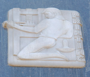
An Art Deco relief, facing South Division Street, representing the printing industry. The Ann Arbor News is no longer printed this way.
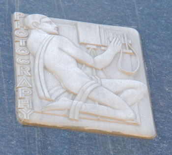
Still, they’re worth a linger. Made by sculptor Corrado Parducci, each of the 19 square-ish reliefs (with some duplicates) represent 13 topics covered by journalists, based on a 1930s worldview: art, aviation, drama, justice, literature, music, photography, printing, radio, science, sports, telephone, and travel. [Aside: We wonder what 13 fields would represent the focus of today's journalists, and whether those topics will seem as quaint in 2082 as "telephone" seems today.] Parducci also did exterior reliefs on the University of Michigan’s Rackham building as well as on several buildings on the Eastern Michigan University campus.
The Art Deco style is reflected in the “rounded corners, the clear lines, the essential shapes of the small reliefs, along with the words set into the edge,” write Martha Keller and Michael Curtis, authors of “Public Art in Ann Arbor and Washtenaw County.”
Keller and Curtis note that the figures in these reliefs are typically kneeling, a position that better allows them to fit into the square design – though, it must be said, also it makes them look extremely contorted. The figures are also relentlessly buff, a fact not remarked on by Keller and Curtis.


I could be biased … let me rephrase that … I am biased but what a great way to start Public Art series with these Art Deco reliefs.
Growing up in Ann Arbor in the 50′s and 60′s, this building and the activity inside was an important part of our lives.
My mother worked as a telephone operator at the phone company around the corner in a building which I am sure many Ann Arbor residents don’t even know exists.
The cell phone, tv and internet have slowly displaced the bricks and mortar in this block with bits and bytes that like the straw scare crow in the field will slowly blow away one piece of straw at a time.
Yes, I have always loved those bas-relief art pieces. This is my favorite, of course: Flickr Account
Building adornment seems to have become a thing of the past. While I’m not saying we should revisit Louis Sullivan, most of the buildings today lack those those adornments that provide us with the joy of discovery. Craftsmanship and uniqueness has given way to concrete slabs and rows of brick with little or no character of their own.
Just in the way of previewing the write up of Tuesday’s council meeting (now in the editing queue):
Roger Pothus, proprietor of Renaissance clothing store, mentioned during the public hearing on the underground parking garage that there were developers who were very interested in the Ann Arbor News building press room. The presses in that room were rendered dormant by the new printing facility built south of Ellsworth road on State Street a few years back.
Pothus’ perspective was that of a new neighbor to the Ann Arbor News building on Division — Renaissance recently moved from its Main & William location to the same complex that houses Google’s offices. Pothus was optimistic about the future of the central corridor.
I think that anything that converted the door on Division back to an actual entry that had people going in and out would be a dramatic improvement for the block. The space might work as a coffee shop of some kind with a name like “The Coffee Press.”
Wow. Super article. A real service. Very Observer-esque, maybe better; perhaps the digital step forward makes looking back and appreciating them all the richer. Never observed these reliefs in all the times I’ve been by there. Thanks!
I love the old presses in the News building. No doubt they were a pain in the ass to operate – the pressmen (some of them my buddies on the bowling league back in the day) nearly killed me when the cover design we used for a special section (designed by Sue Shine, one of the great graphic artists still working there) used a black background and reverse-out white text. But there was a great visceral connection to the newspaper when you could literally feel the building shake during the press run, and could run down from the third-floor newsroom to the first-floor pressroom and watch the text you’d written roll off the press.
When the News opened its new printing facility in 2001, there was much discussion about what do to with the old presses. As I recall, to remove them you’d have to literally tear a hole in the wall. And given their age, it’s unlikely any other publication would want to buy them. There was talk of selling them for scrap (wah!), but again, the cost of extracting them wouldn’t have made financial sense.
And so they sit: hulking, ink-stained steel beauties. Just before a major remodeling of the downtown building, I lobbied unsuccessfully to turn the old pressroom into an employee cafe, leaving the presses in tact, and putting in tables and chairs in the surrounding area. It could be a very cool space, loaded with character and haunted with history.
A few years ago, there were rumors that McKinley was interested in creating a bar there, with a separate entrance for the public off of the Division Street side. I think the name floating around was The Pressroom. In addition to the presses, there’s a ton of unused space where massive rolls of newsprint used to be stored. I assume security for the rest of the building was a concern, if part of it were open to the public like that, but I wasn’t privy to any discussions about that, assuming they even occurred.
I’m guessing this is totally unlikely and probably unfeasible, but I’d love to see that side of the building opened up – huge windows on the Division side (on the part of the building that was added on to the original Albert Kahn structure) letting people peer inside to see the presses, and some kind of public venue, whether a bar or coffee house or art gallery or bowling alley (!) that would ratchet up the activity in that slice of town.
And yes, given my clear affection for the presses, it’s a bit of a hoot to me that The Chronicle is an online-only publication. Much as I love what we’re doing, I doubt I’ll ever wax nostalgic about my MacBook Pro.
A great idea, Mary–and literally Observeresque, since we published excerpts from Keller & Curtis back when it came out. Martha’s still around, still bubbling with enthusiasm and insight, and most days, still painting in her studio above Falling Water.
I love these reliefs too. Did you know that they were removed when the building was remodeled and were put back in 1985 when the News celebrated its 150th birthday? It would be great to have the Huron Street entrance restored and also to use the space with the old presses..I like the Coffee Press idea. It would be a great improvement to the streetscape to have openings in the Division St. side as well. When this building was opened in 1936 it was a major event. It is the only commercial Albert Kahn in Ann Arbor.
On another note, I would wish that the AAPAC would try to get the two Marshall Fredericks reliefs back from Siberia (i.e. the Bentley courtyard) and restored to their rightful place on the LS@A building. They should never have been removed! Shades of the thought police at work.
Thanks so much for this great story! These small plaques are just the sort of public art gems that offer the pedestrian a wonderful moment of visual delight. This is a great way to kick off your series. Keep up the good work!