Column: Meaningful Space in Ann Arbor
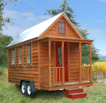
Earlier this month (March 8), the Toledo Museum of Art hosted a program featuring Jay Shafer, the founder of Tumbleweed Tiny House Company and one of the proponents for the tiny homes movement. “Tiny” in this case means only a few hundred square feet, and most of the Tumbleweed designs are under 200 square feet. A newly constructed, 65-square-foot Tumbleweed house, mounted on a trailer and parked on the front steps of the Museum, is among the works presented in the Museum’s “Small Worlds” exhibition.
I attended this program, in part, at the invitation of a friend who lives in Toledo – because I am an architect, and I am working on the design of a small bunkhouse for their summer cottage in Ontario.
Architecture is about creating meaningful spaces and about communicating that meaning to the occupants and users of those spaces. For me, the Small Worlds exhibition triggered a series of thoughts about elements of physical culture in Ann Arbor and whether that culture is successfully serving its purpose in the city.
I’m going to wrap a lot into this notion of physical culture – from pedestrian amenities, to accessory dwelling units, to a phone booth. The phone booth is something I’m planning to add to the physical culture of my own workspace – at Workantile on Main Street in Ann Arbor. So that’s where I’ll start, with something tinier even than Jay Shafer’s 65-square-foot house.
Inside Work
Workantile, a co-working community at 118 S. Main St., is housed in a large, open office space in an old storefront where independent workers can work in the company of others, rather than in solitude. Chronicle editor Dave Askins and I are both members. On any given day, a handful to more than a couple dozen people might be at work throughout the space, all focusing on their own projects. And life in the 21st century means that people get phone calls and need to have conversations that they don’t necessarily want to share.
The open, unbroken space of Workantile, with its hardwood floors and exposed brick walls, makes it very acoustically “live.” The space can be very quiet even when there are a dozen people all working on their own projects, and the ring of a cell phone, or the subsequent talking, can carry through the space. A small “phone room” – a closet with a glass door – provides one bit of acoustic privacy.
If that space is taken, members have learned to use other nooks, such as the landing down the back steps, or a corner by the kitchenette, to avoid intruding on other members. But there are times on busy days when several people all need to talk on their phones at the same time, and there aren’t enough corners for everyone. So I am working on the design of an indoor phone booth.
Workantile members using their phones will have some additional privacy for their conversations, and other members will have less of a noise distraction.
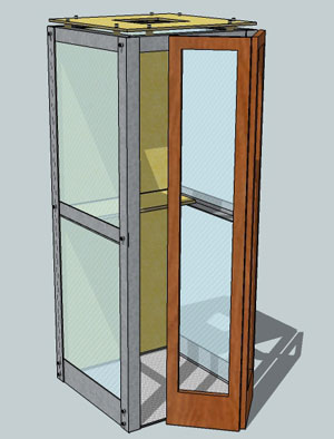
The phone booth will be a tiny place, more a piece of furniture than a room, and it won’t even include the amenity that phone booths have traditionally offered – a phone.
Instead, it will indicate through its physical attributes that it’s the place you go to use your phone. It’ll look like a phone booth, and the sides will be transparent, so when Workantile members use it, it’ll be clear what they’re doing in there – using their phones.
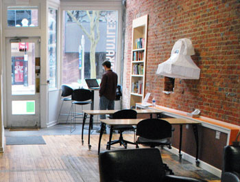
A view from inside Workantile onto Main Street. The telephone-shaped object hanging on the wall does not denote that it's a good place for making a phone call. It's a luminary that was constructed at one of the workshops in preparation for the FoolMoon celebration on Friday, March 30.
The current “phone closet” already offers the functionality that the phone booth will. But for a visitor or a new member, the intended use of the phone closet is not self-evident. It looks and feels like a very tiny office, with a door like any other door in the Workantile. You can’t see what people are doing in there. We could put a sign next to it to identify it as a place for phone calls. But that would not convey as clearly and as intuitively, even from 40 feet away, a basic fact about the Workantile community: The phone booth is a good place to take phone calls, and generally we try to be considerate of other people working.
Once it’s built, new members won’t have to ask where they can go to have a phone conversation. The physical form of the phone booth will serve to define and reinforce the intended activity. And it will do that with less confusion and conflict between different users who are sharing a single space.
Outside Travel
Most Ann Arborites are not Workantile members, so they do not need to worry about how to share indoor space cooperatively by using their phones in the right places. But outdoors, we share space with each other throughout the city – as phone users, pedestrians and motorists.
I recently had a near encounter with a young woman (likely a student, given her apparent age and proximity to campus) who, while talking on her phone, walked out in front of my vehicle in the middle of a block, emerging from between two parked cars. She crossed the street with the seeming certainty that the law gave her the right to cross wherever was most convenient. There are those who think that a new city ordinance gives pedestrians carte blanche (and that the city’s laws take precedence over the laws of physics).
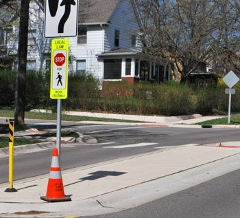
Seventh & Washington in Ann Arbor looking northwest. The crosswalk includes an island in the middle of the street as well as a "local law" sign.
Many of the pedestrian/vehicle crossings in Ann Arbor offer little beyond some road paint, and a tiny local law sign in some instances. These don’t do a particularly good job of encouraging pedestrians to cross at particular points, nor do they help manage the interaction between pedestrian and vehicle. Establishing ordinance language coupled with enforcement does not necessarily encourage the main behavior we’d like to see motorists and pedestrians display: caution. Instead it encourages people to think in terms of “rights.”
What we have, then, are crossings where pedestrians have a legal right-of-way, but little more than crosswalk markings and signage to distinguish the point. Pedestrians (if they want to be safe) must still play a waiting game to see if traffic will slow stop before they can venture into a cross walk. Motorists must estimate whether someone standing in the general vicinity of a crosswalk intends to cross, or perhaps is merely waiting for a bus at an immediately adjacent bus stop.
As more motorists conform to the requirement that they yield to pedestrians, other motorists are confronted more frequently with stopped or slowing vehicles ahead of them. A stopped or slowing vehicle by itself is sometimes not a sufficient cue to an inattentive following motorist – and that can result in a rear-end collision. I’ve seen the aftermath of at least one such incident like this along Plymouth Road.
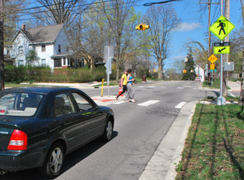
Seventh & Washington in Ann Arbor. The signal is flashing yellow. The camera caught it between flashes. Recently, pedestrian-activated rapid flashing beacons were installed with additional signage – look for the horizontal bar just below the yellow diamond. The two pedestrians here did not activate the flasher – but when they'd alighted on the center island, the motorist yielded.
Changes to physical culture that go beyond road paint and signs can convey meaning to pedestrians and motorists alike – and provide additional cues that their behavior needs to accomodate a special circumstance. Take for example Ann Arbor’s relatively new HAWK pedestrian crossing signal and the very new rapid flashing beacons. The HAWK has been installed along Huron Avenue just west of downtown, and the rapid flashing beacons have been installed at crosswalks along Plymouth Road and at Seventh & Washington.
Such signals invite pedestrians to do something more than just stand there – they’re meant to press a button to activate the signal. And the signals provide an unambiguous indication to motorists of a pedestrian’s intent. The flashing lights provide an additional cue to following motorists, to alert them to a possibly slowing or stopped car ahead.
However, meaning-laden physical infrastructure need not take the form of signalization. An example of a simple, meaningful infrastructural element – that conveys the same message as a blinking yellow light or a sign that reads “SLOW” – can be found in a residential street in Bloomington, Ind. (pointed out to me in a conversation with Chronicle publisher Mary Morgan). On South Lincoln Street where it crosses Dodds Street, the curbs are bumped out into the roadway on both sides.
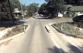
Northbound South Lincoln Street at Dodds Street in Bloomington, Indiana. (Image links to Google Streetview)
Motorists and bicyclists need to exercise added caution to navigate through the narrower space. And a pedestrian who’s crossing Lincoln Street can venture into the roadway by the width of the bump-out, to get a clear view of traffic that might be approaching. It’s also clearer to oncoming motorists what the intention of such a pedestrian might be. The bump-outs also reduce the width of roadway that pedestrians must cross – reducing their potential risk of being struck by a car.
Of course you don’t have to travel to southern Indiana to see bump-outs. They’re also a part of the Fifth and Division streetscape improvements that were undertaken in downtown Ann Arbor over the past year.
The bump-outs are consistent with an idea that’s been tried in several European cities – completely removing signage and signals.
The distinct lack of all traffic signs conveys meaning – that everyone needs to proceed with care and be fully aware of their surroundings; no traffic light or street sign will tell you what to do or who has right of way. In these cases, drivers have to adapt and be more considerate of other drivers and pedestrians.
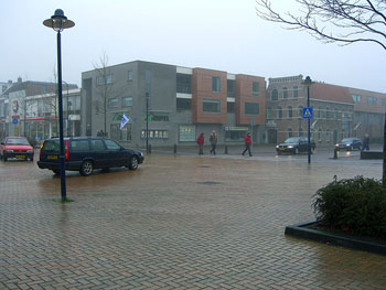
Example of an intersection in Drachten Holland with little signage and no signalization. Photograph by Jerry Michalski.
Everyone using the space, drivers and pedestrians alike, have equal rights. They pay attention to what is going on around them. They also work more cooperatively, because everyone instinctively understands that two people or vehicles can’t occupy the same space at the same time. People who are given no external cues at all tend to work together to get through each encounter with a minimum of disruption to all. And the rate of accidents and of injuries to pedestrians has been reduced where this approach has been tried.
As Matthias Schulz notes in writing about cities without traffic controls, “Psychologists have long revealed the senselessness of such exaggerated regulation. About 70 percent of traffic signs are ignored by drivers. What’s more, the glut of prohibitions is tantamount to treating the driver like a child and it also foments resentment. He may stop in front of the crosswalk, but that only makes him feel justified in preventing pedestrians from crossing the street on every other occasion. Every traffic light baits him with the promise of making it over the crossing while the light is still yellow.”
Physical Limits
It was the use of physical limits on space, and the extreme example of Jay Shafer’s tiny houses, that first got me thinking about physical culture. The initial drive to create a tiny house came from Shafer’s belief in a lifestyle that does not require a large number of possessions. The tiny house movement may just be a counterpoint to the inflation in house sizes that has occurred over the last half century. Instead of pushing to add space to a house because, “we’ve got too much stuff,” opting for a tiny house is a choice that requires more materially-limited living.
It would be possible to attempt a simpler lifestyle living in an average-size house. But one of Shafer’s tiny houses creates a physical limitation on the occupant that enforces a simple lifestyle requiring only a few physical possessions. It is much easier to live a life with just a few possessions if your home offers only 65 instead of 2,700 square feet. That latter figure was the average-sized American new home in 2009 – more than 40 times the size of the XS Tumbleweed house.
Shafer doesn’t try to satisfy all possible needs within a small house. Instead, he believes in living in the larger community. The town becomes your living room, with all of its amenities to choose from; the local restaurants serve as part of your kitchen, which help supplement the lone hotplate in a Tumbleweed house.
Legal Limits on Space
If living in a tiny house means living in the larger community, part of that includes putting your tiny house on some land somewhere in the physical space of that larger community. Most communities have laws that govern how land may or may not be used – zoning laws. Zoning laws define, among other things, what kinds of buildings may or may not be built on a particular piece of property, and where a building can or cannot sit on the property.
When Shafer lived in Iowa, where he built the first model of the tiny house, he originally had it on a piece of property six miles outside of town. But he wanted to reduce his travel distance into town, to align better with a lifestyle of reduced material consumption. When he went about moving his house into town, he found that the house was smaller than the minimum allowable building size. What he wound up doing was buying the cheapest house in town and moving his tiny house into the back yard of that lot. He then lived in his tiny house while he rented out the “main” house to others.
Of course, Ann Arbor has done its own dance around the issue of tiny houses. That’s taken the form of a conversation about whether to allow the construction of an accessory dwelling unit (ADU) or so-called “granny flat,” a detached building, usually just a one-bedroom apartment, on the same lot with a house. ADUs might be a bit larger than the Tumbleweed tiny houses, but they’re still generally no more than a few hundred square feet.
Although the city of Ann Arbor planning commission has looked at the issue of accessory dwelling units several times over the last decade or so, the matter has never been brought before the city council for consideration. That’s because it has been a focus of vocal opposition from some quarters.
Currently, the only kind of “accessory apartments” allowed in Ann Arbor are those that are attached to the principal dwelling and are less than 600 square feet. Additional requirements include: The principal dwelling must be owner-occupied, and the occupant of the accessory apartment must be a relative of the owner. The special exception use for accessory apartments has been sought only twice since it was added to the zoning regulations for residential properties in the 1980s.
A Tumbleweed tiny house parked in an Ann Arbor backyard could not meet the conditions of the special exception accessory apartment use. But as a detached accessory dwelling unit, a tiny house, whether a trailer-mounted Tumbleweed house or a site-specific small accessory building, could offer great benefit to those who would like to have a family member live on the premises, but not necessarily under the same roof – such as an elderly parent or a teenager who needs a bit more private space.
And a tiny house could offer an older homeowner the option of having a tenant who could also help with some chores as part of a rental agreement. But that arrangement would also fail to meet the current standards of a special exception accessory apartment use.
Allowing detached ADUs on appropriately-sized lots with less strict conditions on occupancy arrangements would provide immediate benefits to property owners. And it would permit an incremental increase in total population density over time. Even if such an ordinance revision were to be approved by the city council, it would likely take a number of years before many homeowners added such buildings to their property.
Concluding Thoughts
Using the physical environment to express a rule and to enforce a concept is nothing new. We’re familiar with the idea that keeping people off the grass is more effectively achieved with a security fence, not just a sign that reads “Keep Off the Grass.”
But security fences aren’t necessarily pretty. A border of flower beds might just as effectively keep people from trampling on a lawn. As we think about building a physical environment that helps shape our interactions, I think it’s worth focusing on making those physical elements attractive as well as functional. Too often, a design gets focused on serving just one function or achieving one goal, and it may accomplish that end adequately, but it’s not terribly attractive.
HAWK signals and rapid flashing beacons are examples of a functional way that physical infrastructure can help support the goals of a pedestrian-friendly city. But they are not things of beauty.
It’s not hard to imagine a more attractive way to manage the interface between cars and pedestrians, even though I’m not a traffic engineer and have no expertise in designing aesthetically-pleasing traffic infrastructure. But I do know something about designing indoor spaces for people to inhabit, even if it’s just for the brief time required to take a phone call. I’m hoping to complete the first version of the phone booth in a couple of months.
If you’d like to see it in person, stand outside the door at 118 S. Main and peer inside. For a member of the Workantile community, your standing there will convey meaning. And someone will likely come open the door for you.
The Chronicle relies in part on regular voluntary subscriptions to support our publication of local columnists like Philip Proefrock. Click this link for details: Subscribe to The Chronicle. And if you’re already supporting us, please encourage your friends, neighbors and colleagues to help support The Chronicle, too!


This is an intriguing exploration of our interactions with physical space. What I take from it is that we would do better to be mindful of our surroundings. I do, however, believe that pedestrian markings are helpful and I am grateful to the city for expanding their application. Now if we did have fewer signs (those ugly “wayfinding” signs put up by the DDA are a good example), perhaps we would see the meaningful ones better.
My pedestrian story: yesterday I watched with disbelief as a woman with a baby in a carriage pushed it calmly across 4 lanes midblock on Jackson Avenue in rush hour. She crossed two incoming lanes that were vacant because of the light at Maple, then threaded her way through the outbound cars stopped for that light, to reach the sidewalk along Veterans’ Park. I’m guessing that she had done this many times and knew how to estimate the light changes. None of us moved, of course, though I would not personally have placed so much trust in a double line of people anxious to get home.
‘Tiny houses’ really intrigue me. I’m not sure what public health and welfare benefit comes from forcing people into homes that are larger than they require or want. Or, for that matter, can afford.
As the accessory dwelling discussions of a few years ago outlined, tiny houses can greatly benefit families and reduce dislocation. With a resurgence in multi-generational households, this would seem to provide a compromise — independence, proximity, sustainability, and access to a family laundry room.
I’d like to know the distance at which someone with sight good enough to legally obtain a driver’s license is expected to be able to read the ‘local law’ signs. Then I’d like to know if that person is traveling at the speed limit, whether it is physically possible, after having read the sign, to stop a car before the crosswalk.
The only problem with the HAWK symbol is, as a driver, I have no idea how long I have before the light changes completely. Do I need to slam on the brakes? How many stages of this crazy blinking are there? Why not just have a regular traffic light that is activated only when the button is pressed?
Also, I’ve had a cop not stop for me in a crosswalk that was managed by those local law signs. A cop who was very clearly not in a hurry.
Here’s another idea, instead of a phone booth you could put in a “Get Smart” style Cone of Silence.
It seems like Workantile should have real offices. Open plan offices are nice for collaboration, but not everyone works that way.
Division Street at E Jefferson could really use a HAWK. I stopped there a couple days ago for a pedestrian and at least 20 cars went through the intersection in the other lane (including the 6 that were behind me).
Jeff, I am one of the co-owners of Workantile, and wanted to clarify what we are and why the space is the way it is.
Workantile is a community of independent and remote workers who for any number of reasons are tired of working in isolation in home offices, coffee shops, libraries, or wherever, and want other people around. There are, of course, a number of social and professional benefits to having others around. The space is designed to support that community. The people who join Workantile are members of the community, not people renting space. We deliberately stayed away from individual offices because people tend to isolate themselves in them and detach from the community. Members who do need a quiet space to work use the carpeted loft. The loft is still open, but quieter than the main space.
The open floor plan gives us a lot of flexibility in reconfiguring the space as needed. For example, every Thursday we have a social lunch. We push all the tables together, and people gather around and eat together. After lunch, the tables are separated back into individual work spaces.
Phil, while I love that you’ve included the woonerf in your write-up, I had been planning to bring it up as a counter-example. Where ped islands and HAWKs and bump-outs convey expectations of pedestrian activity through the design, the explanation I usually see of the woonerf is that it conveys a lack of expectation, specifically, of who may have (or have to yield) the “right of way”. Where all the other elements work to more clearly demonstrate right of way, the woonerf removes it, and forces a consciousness of other road users of all types.
Of a kind, in one of the cities I work in, a councilmember explained that several residential neighborhoods have no stop signs (or yield, or anything) at the intersections, for similar reasons–no driver can assume the person on the cross-street is going to stop, so they both have to slow down to figure it out; a child on the sidewalk can’t look at a stop sign and assume that the oncoming car is going to stop, reinforcing the “look both ways” mandate. I didn’t have a chance to ask about the actual performance of this scheme, but it was the first time locally I’d run across a conscious application of this principle (albeit decades old).
Murph, yes, I think your description of woonerf streets (streets without control signage) is exactly right. It’s a designed absence, and that too, conveys what is expected (that everyone will be careful and exercise due caution). But it needs to be in a place where there is enough surrounding structural roughness (cross streets, intersections, pedestrians, etc) that it will work. A woonerf strategy probably would not work on a more open road like Plymouth Road.
Multi-lane roads also work less effectively in this way than single lane ones do. Think about the way that an intersection with traffic lights works when the power goes out. Those with single lanes tend to work more elegantly and efficiently than those with multiple lanes, left-turn lanes, and the like.
We have a woonerf intersection (one with no signage or signals) at Huron and Ninth that I went through today on my way home today. It didn’t work for me.
Not sure what intersection you may mean, Jim. Doublechecking with Google street view shows a stop sign for 9th at Huron.
If it’s not there in the real world, it’s a temporary thing, I suspect.
The term woonerf applies to a street or a district, not a single intersection.
I wasn’t being entirely serious. I understand that the concept doesn’t work in a place like that without some serious calming measures. I was talking about crossing Huron at Ninth. The crosswalk there is completely unmarked, and the drivers don’t seem to know it’s there.
If a crosswalk is unmarked, can it be said to “be there”? *puffs pipe, rubs jaw pensively*
Re #12: this may have been meant humorously, but it is a serious question that needs to be asked. We do have curb ramps that lead across streets but have no special markings. Do they have any legal status or not?
I was considering this the other day as I stood at one on Depot Street and watched the traffic whiz by at full speed without, apparently, even considering whether I was about to cross.
When even Vivienne is unsure of the legal status of these crosswalks, I’d say we have a big problem. Yes, they are legally crosswalks, and cars are required to yield to pedestrians in them. The relevant law is Michigan Vehicle Code Act 300 of 1949, 257.10 “Cross-walk” defined.
The situation is less clear at, for example, Eighth and Huron. If the sidewalk doesn’t extend to the edge of the road, I don’t know whether it’s a crosswalk or not, and I have never met anyone who could tell me despite many years of asking. I have even searched case law. I don’t think anyone knows.